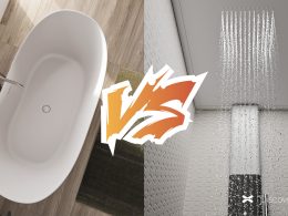
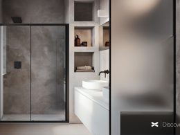
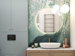
This month’s project focuses on the renovation of an apartment in a building dating back to the 1970s, in a seaside resort. With two bathrooms, one for guests and one for the master, the design of this beach house proved to be optimal for relaxation solutions.
This month’s project
We are in a seaside resort in the province of Venice, the 120 m2 apartment is partially renovated and already inhabited. Located on the third floor of a building dating back to the late 1970s, it is the realm of Chiara and Paolo. Chiara and Paolo’s desire is to create a dedicated bathroom for guests, capable of solving the need for toilets in the immediate vicinity of the living room, while, for the master bedroom, to create an oasis of well-being with a freestanding tub from the center of the room.
Chiara and Paolo’s ideas for this bathroom project are clear: modernity and tradition must coexist in their space. Fond of parquet dating back to a late 80s renovation and then maintained over time, the bedroom and guest bathroom must therefore be modern in their elements but devoted to a vintage style. In the guest bathroom, the flooring will change, but keep the same ideals.
With a beach house style bathroom, the desire to bring out all the characteristics of the sea was fundamental in the choice of finishes. From the colours, to the tactile sensations of some materials, everything is reminiscent of the marine environment. This is the moodboard that Chiara and Paolo had identified for the furniture and sent us for the choice of finishes:
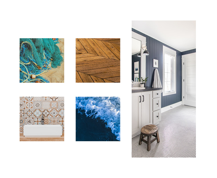
Moodboard for the service bathroom
Master bathroom
The project of the month starts immediately with the master bathroom, which presents itself as an effective detachment from the master bedroom. Developed horizontally and capable, in size, of having large and comfortable spaces where you can take a relaxing shower.
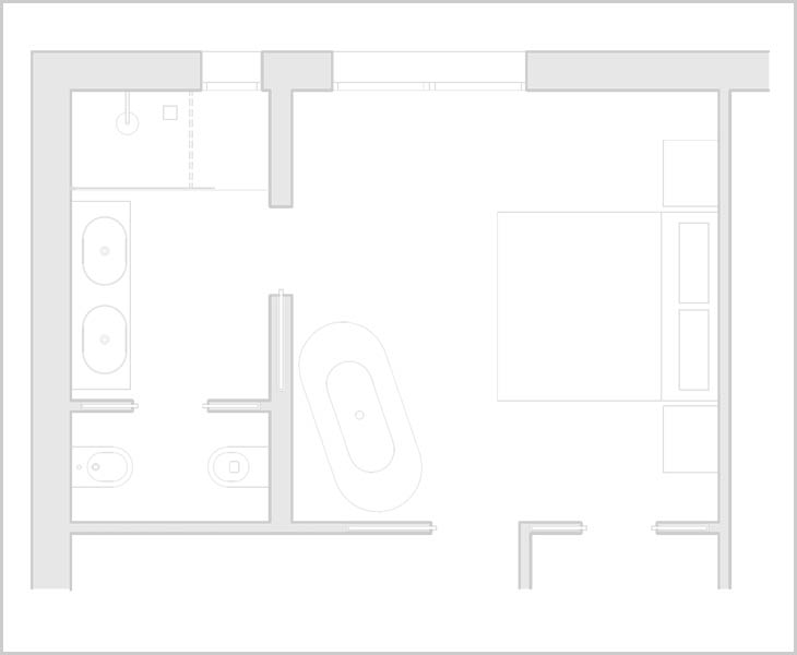
Plan of the master bedroom
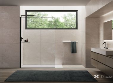
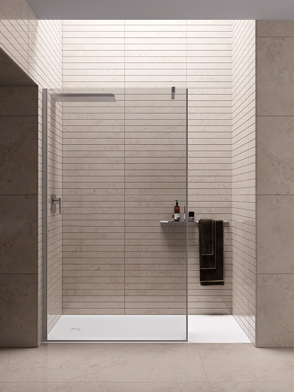
Our advice in this case was to use a walk-in shower enclosure, perfect for when time is limited. Particularly suitable for the natural niche created with the bathroom renovation, it is simple, fresh, fast. Chiara and Paolo’s choice fell on an 8 mm walk-in wall like Wall 8A with a polished finish, elegant and perfectly in line with the colors of the bathroom. Wall 8A is a glass wall in which transparency is the undisputed protagonist, perfect for a niche.
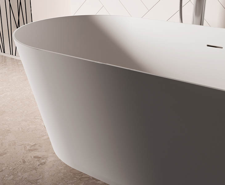
In the bedroom, just outside, queen of the room, a freestanding solid surface bathtub has been positioned, with a pure white and almost velvety finish. Lilium was chosen for its modern and graceful features, not bulky.
Guest bathroom
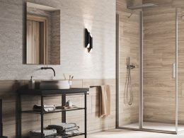
For the guest bathroom, the ideal solution was Unico SC1, also in a niche. The sliding door shower cubicle fits perfectly into the niche of the second bathroom. It brings with it the functionality of a shower cubicle with a lower profile capable of increasing the containment of water and sand.
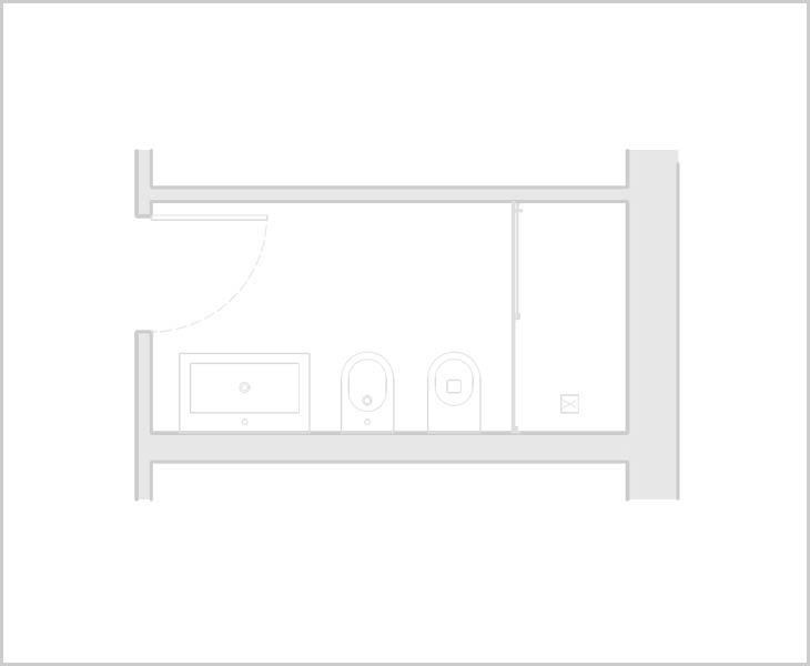
Floor plan of the service bathroom
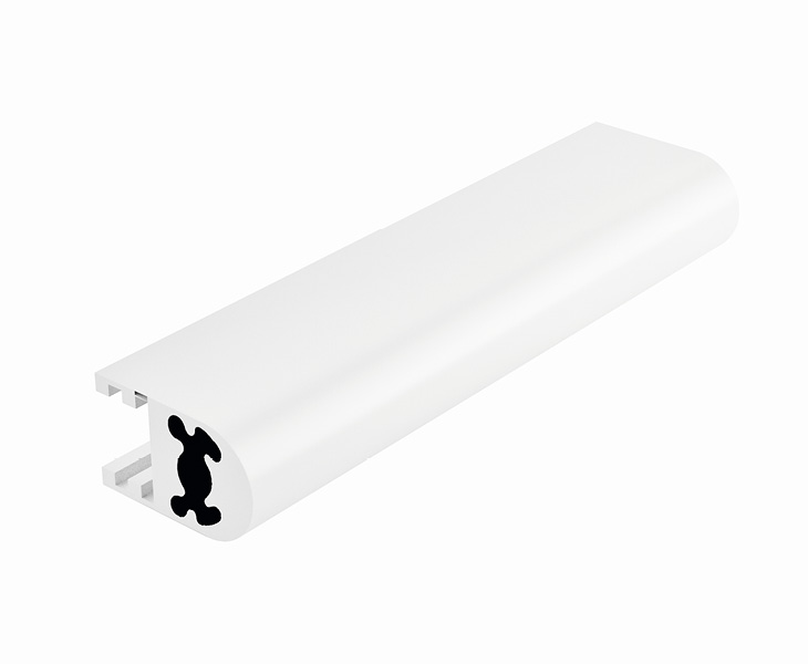
The finishes chosen were an obvious consequence of the mood of the guest bathroom, which moves between blue and white, in full nautical style. In perfect contrast with the blue that can be seen sporadically on the walls, the profiles are white. Consistent with the faucets and nautical style that adorns the room.
White aluminum finish


